top of page
HOME
PROJECTS
More
Use tab to navigate through the menu items.
LET'S CONNECT
MY
PROJECTS
BLOOM BOOKS BRAND IDENTITY
LOGO DESIGN
WEBSITE DESIGN
THE PERFECT POUR STARTS WITH TITO'S CAMPAIGN
SOCIAL MEDIA
WEBSITE DESIGN
PHOTOGRAPHY
GRAPHIC DESIGN
ATRIA BOOK WEBSITE REDESIGN
WEBSITE DESIGN
GRADUATION PHOTOGRAPHY
PHOTOGRAPHY
LANEIGE PRODUCT CATALOG
GRAPHIC DESIGN
IRL AGENCY
WORK
SOCIAL MEDIA
GRAPHIC DESIGN
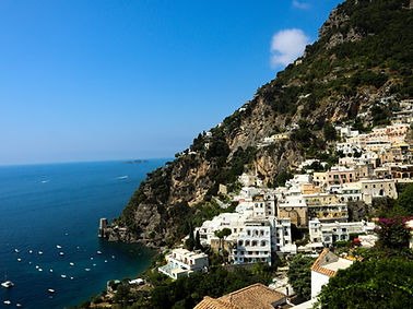
TRAVEL PHOTOGRAPHY
PHOTOGRAPHY
THE NATURE OF LEARNING IN NATURE
PHOTOGRAPHY
SAINT YVES, ABIGAIL, AND STRAND
SOCIAL MEDIA
GRAPHIC DESIGN
TRAVEL PHOTOGRAPHY
PHOTOGRAPHY
BA LE SOCIAL MEDIA LAUNCH
PHOTOGRAPHY
SOCIAL MEDIA
BA LE SOCIAL MEDIA
SOCIAL MEDIA
PHOTOGRAPHY
bottom of page


.png)


.png)
.png)

.png)
_edited.jpg)